You may also be interested in...
A heat map is a graphical representation of data where the individual values contained in a matrix are represented as colors. Fractal maps and tree maps both often use a similar system of color-coding to represent the values taken by a variable in a hierarchy. Heat maps help you get an instant feel for an area by grouping places into categories and displaying their density visually. The darker the color is, the higher is the density.
Step 1: Go to
Click on the Add New Question link.
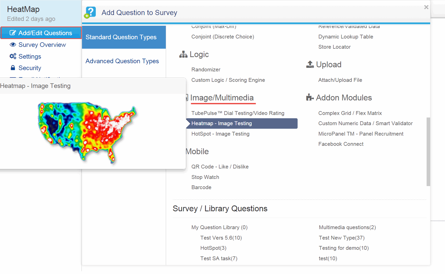
From Advanced Question Types section select the Heatmap - Image Testing question type from the Image/ Multimedia list and click it.
1. Screenshot

Step 2:
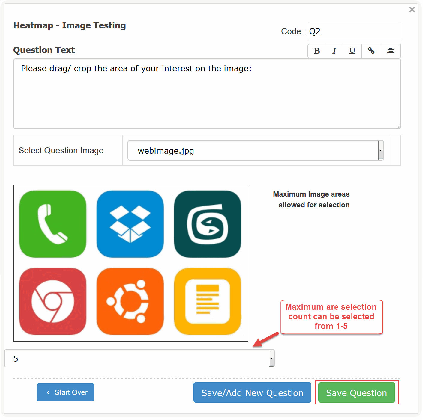
Question Text: Enter in the Question Text here.
Image: Select the Image from the drop-down menu.
2. Screenshot

Click on Save Question to add the question.
You have successfully added the Heatmap - Image Testing question to your survey.
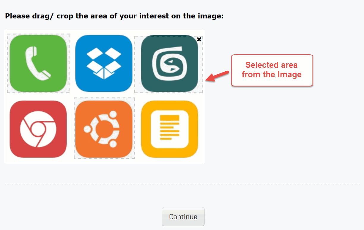
To answer the Heatmap - Text Analysis question, respondents will have to drag the area on the image.
3. Screenshot

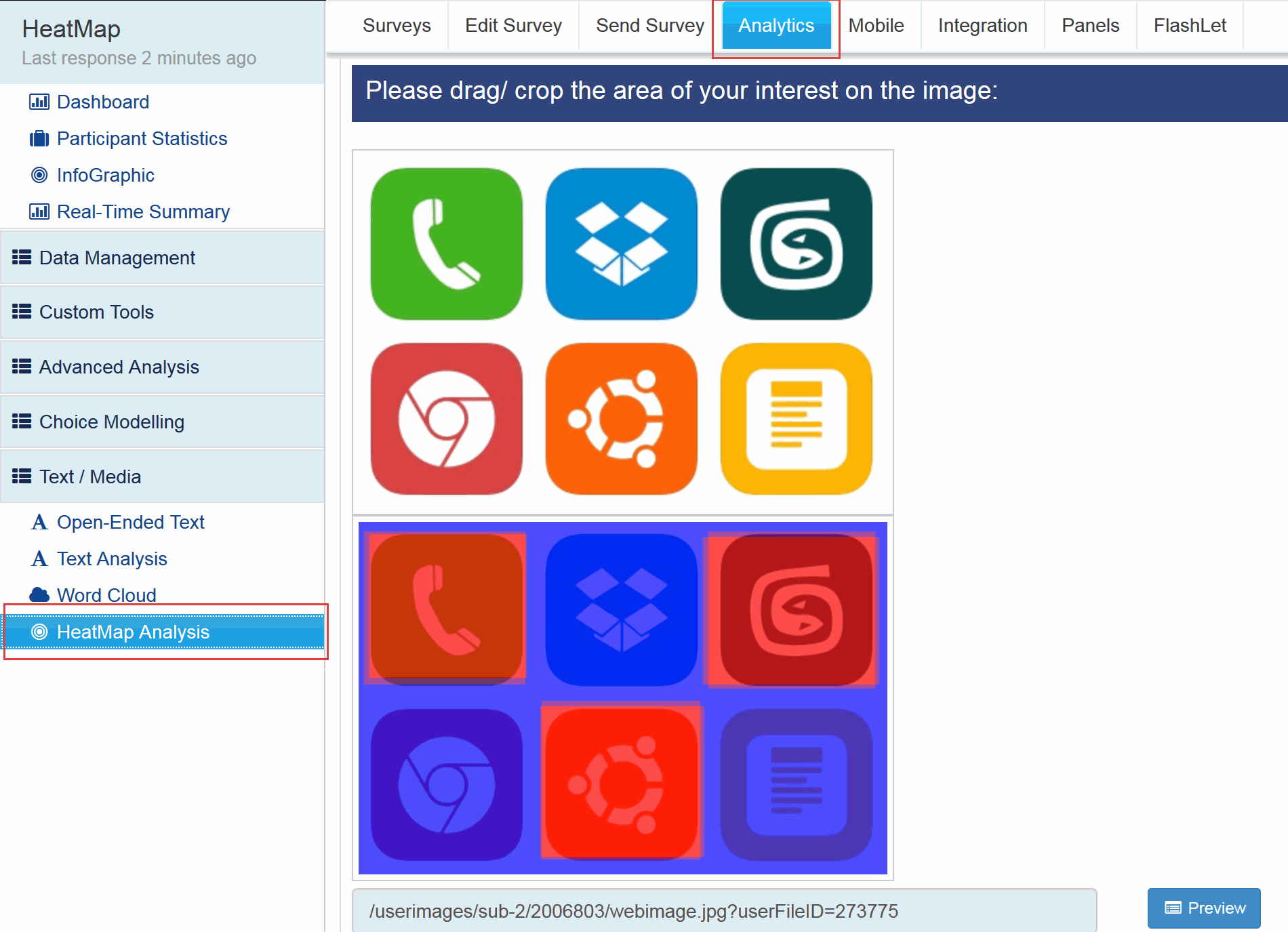
With the Survey Analytics Enterprise Platform you can analyze the heat map data in a very sophisticated way. You will get an image representation of your original image for the data. The area that was dragged most often by the respondents would be highlighted in dark red. The lesser number of times an area is dragged, the fainter red color it would be highlighted in. The areas that were never dragged would be highlighted in blue. You will easilly come to know the respondents trend / area of focus by just viewing the image. Go to:
4. Screenshot
